Title Design
Welcome back to my blog! My group and I are getting close to filming our final task. This means I get to design our title for the sequence.
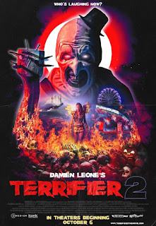
- The first scene will include credits with the font “chiller” in the middle of the screen. This text will be in a normal to large font size.
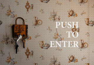
-For the credits that are to be embedded in the scenes, some examples of places the words would be located on are knives in a drawer, on a creepy-looking bookshelf, inside a broken floorboard, and when the character looks through a window and it’s on a wall outside the window.
-Possible title: The title for this film will most likely be something like “House of Horrors”
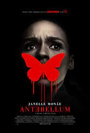
-The title will be bolded and in the font “Creepster”. The font color will be a dark red.
-The main title will have a slight pulse and then will fade out.
-The title will last about 3-4 seconds while the credits will last 2-3 seconds each.
-The name of the person who did the job will be a font and a half sizes bigger than the job they did.
>For example, Edited by: JAMES SMITH


Comments
Post a Comment